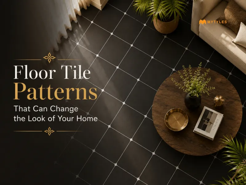
.svg)


White And Red Full Body Vitrified Tiles: Bold Flooring Ideas For Modern Indian Spaces
ByNandana Priya
Mon , Jun 29 , 2026
Read Time: 5 Min
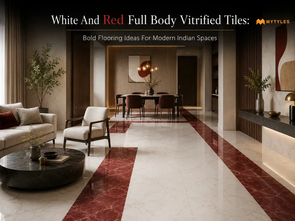
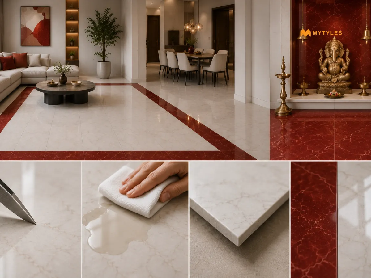
A red floor makes a statement. A white floor keeps things clean and open. Both are strong choices on their own. But when white and red full body vitrified tiles come together in the same space, something shifts. The contrast feels attractive. The room looks designed rather than decorated.
Full body vitrified tiles carry the color all the way through the body, so the floor holds up the way it looks on day one, even years later. This blog covers what makes full body vitrified tiles a smart buy, how white and red work together across different rooms, layout ideas worth trying, and what to check before you order.
What Are Full Body Vitrified Tiles?
If you have noticed, most tiles carry their color and design only on the surface. The base would look completely different from the top layer. Full body vitrified tiles work differently. The color and pattern go all the way through the tile, from top to bottom. This matters more than it sounds. As small scratches or edge chips barely show because the interior of the tile looks the same as the surface.
These full body vitrified tiles are made by pressing clay, silica, quartz, and feldspar together at very high temperatures. The result is a dense, low-porosity tile with water absorption well below 0.5%. They are tough underfoot, easy to clean, and resistant to scratches, stains, and heavy foot traffic.
Why White And Red Full Body Vitrified Tiles Work In Indian Spaces
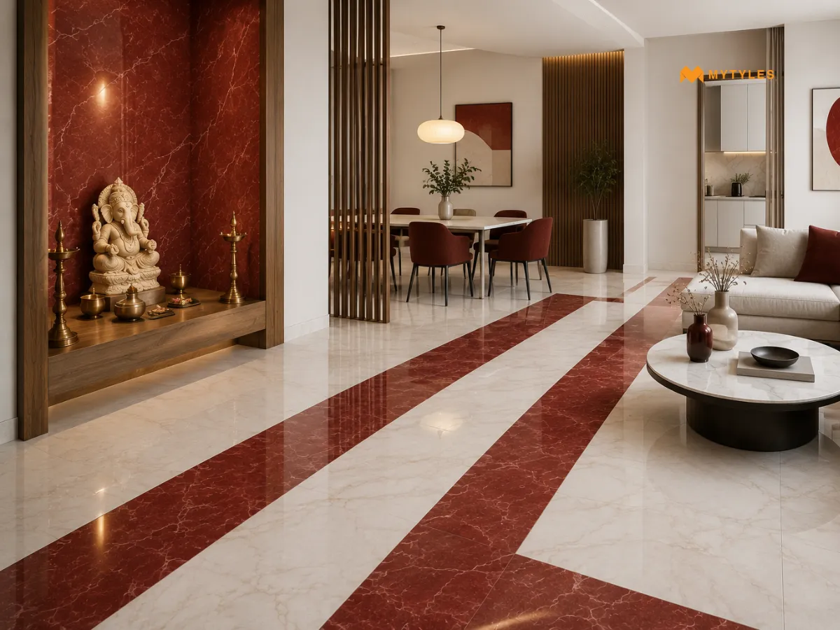
Red has always had a place in Indian interiors. It is a color that carries warmth and energy. The red full body vitrified tiles work well in entrances, pooja rooms, and dining areas.
White, on the other hand, opens spaces up. They brighten the space by reflecting light. In smaller apartments or rooms with limited natural light, a white full body vitrified tile can change how the entire space feels. They suit living rooms, bedrooms, and kitchens.
Each color is eye-catching on its own. But when used together, it’s the contrast between the two that makes white and red full body vitrified tiles so striking.
White Full Body Vitrified Tiles: Where And How To Use Them
The best thing about white tiles is their flexibility. White full body vitrified tiles work in almost any room. However, the finish and size should match the space.
Space | Purpose |
|---|---|
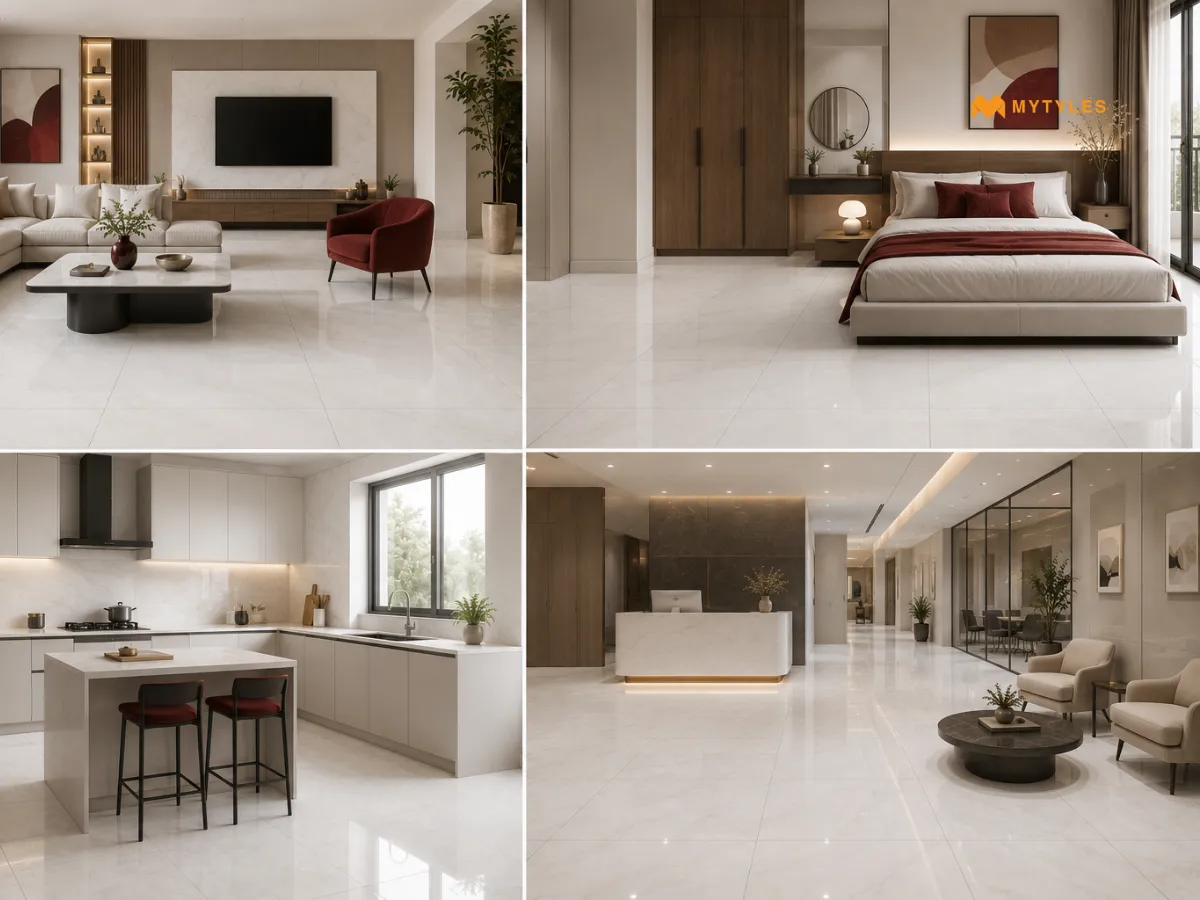
| Living Room | Living rooms are one of the best places to use white full body vitrified tiles. Glossy finish makes the room feel larger and brighter and a matt finish keeps the look clean. This works especially well in apartments. |
| Bedroom | Bedrooms also look beautiful with white flooring. A white floor can make the room feel peaceful. Paired with warm wood furniture or soft textiles, they add a quiet luxury to the space. Matt or satin finish works best here since it keeps the bedroom feeling calm. |
| Kitchen | White full body vitrified tiles in the kitchen are practical. Choose a matt or slightly textured finish because it gives better grip. |
| Commercial Spaces | White full body vitrified tiles are widely used in showrooms, clinics, and offices because they project a clean and professional look. The full body construction with matt finish can handle heavy foot traffic. |
Red Full Body Vitrified Tiles: Where And How To Use Them
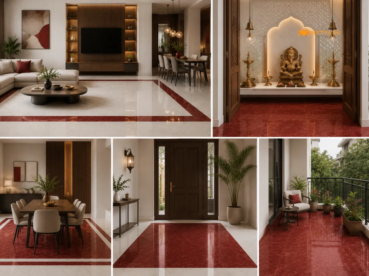
Red has always had a place in Indian interiors. This is a color that brings in warmth and energy. The red full body vitrified tiles are good for entrances, pooja rooms, and dining rooms.
Space | Purpose |
|---|---|
| Accent and Border Use | Red can be used as a border around a white floor or as an inlay pattern at the centre of a room. |
| Outdoor and Balcony | Red full body vitrified tiles hold up well outdoors. The color is retained in outdoor conditions. |
| Entrance and Foyer | A red floor near the foyer or main door creates a warm welcome. Paired with white walls and minimal decor, a red entrance floor feels balanced. |
White And Red Together: Layout And Pattern Ideas
The way the white and red full body vitrified tiles are laid changes the entire feel of a room. Here are a few approaches worth considering.
Pattern | What It Means | Where This Pattern Will Work Better |
|---|---|---|
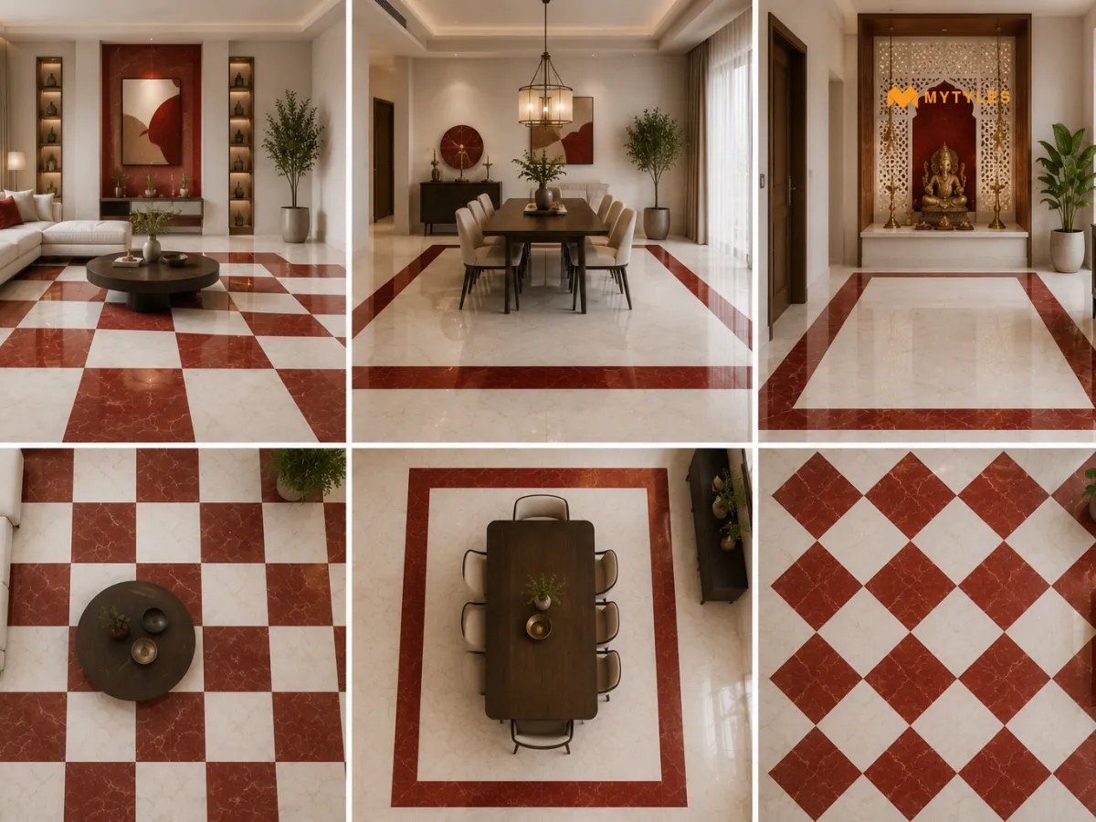
| Checkerboard Pattern | White and red squares alternating across a floor is one of those layouts that never really goes out of style. | Checkerboard floor tiles work best when the room gives the pattern room to breathe. Larger spaces are best for this. |
| Border and Field Layout | Pick one colour for the floor and let the other run along the edges. A white floor with a red border creates a neat space. | This works well in dining rooms and pooja rooms. |
| Diagonal Laying | The same white and red tiles laid at an angle instead of straight change the entire mood of a room. | A contrast floor tile design in white and red, laid diagonally, makes even a simple square room feel more dynamic. |
Why Full Body Vitrified Tiles Are A Practical Choice For Indian Homes
The floors for Indian homes need to handle a lot. Dust from the street, water from the monsoon, daily mopping, and the occasional heavy furniture being dragged across the floor. Full body vitrified tiles are built for exactly this.
- Scratch Resistance: Since the color goes all the way through, scratches are less visible than on surface-printed tiles.
- Low Maintenance: A regular mop and a mild detergent. That is genuinely all these tiles ask for. No sealing, no special products, nothing complicated.
- Color Consistency: The color runs through the full thickness of the tile and remains more consistent over time. The floor looks the same as it did on day one.
- Versatile Finish Options: Available in matt and glossy. Matt finishes are generally preferred for outdoor and wet areas, while glossy finishes are more suitable for dry indoor spaces
White And Red Full-Body Vitrified Tiles: Quick Checklist
- Match the batch number and shade code across all boxes for both the white and red tiles. Shade variation between batches is real and shows up clearly on a finished floor.
- Buy full body vitrified tiles online or in store. Always order 10 to 15 per cent extra, depending on the pattern. Diagonal and checkerboard layouts need more cuts and more material.
- Check that the finish type suits the room. Matt for wet areas and outdoor spaces. Glossy for dry indoor rooms with good light.
- Confirm the tile size fits the layout you have planned. Larger format tiles need a flatter, better-prepared surface to avoid lippage.
Bring White And Red Full Body Vitrified Into Your Space
White and red full body vitrified tiles are one of the few flooring choices that work hard and look bold at the same time. The color holds, and the surface lasts. Whether the goal is a bright, minimal white floor or a bold red surface that anchors the room, the range covers both without compromise. Browse the complete range of full body vitrified tile design options at MyTyles. Find exactly what your space needs. Visit the MyTyles website or step into our experience centre and see the tiles in person before you decide.
Expert Reviewed by Biren Agrawalla
Biren Agrawalla, the Founder of MyTyles with over 10 years of experience across tile, retail, and home decor. Driven by a passion for tiles and a deep understanding of customer behaviour, he has spent his career transforming how people discover and buy tiles online. Biren combines practical retail insight with modern digital solutions to make tile shopping smarter, more intuitive, and design focused. At MyTyles, he champions a customer first approach, ensuring every experience from browsing to buying is reliable, seamless, and inspiring.

Why Are White And Red Full Body Vitrified Tiles Considered A Bold Flooring Choice?

White and red full body vitrified tiles create a strong visual contrast that instantly draws attention to the floor. The combination balances brightness with energy, making spaces feel more dynamic and distinctive. These colors work particularly well in modern Indian interiors where homeowners want flooring that stands out while still maintaining a clean and organised appearance.
Where Can White And Red Full Body Vitrified Tiles Be Used In A Home?
White and red full body vitrified tiles can be used in living rooms, hallways, dining spaces, balconies, and large open areas. Their striking color combination helps create a focal point within the home. When planned carefully, these tiles can add personality to the space while remaining practical for everyday residential use.
Do White And Red Full Body Vitrified Tiles Work Well In Modern Interiors?
Yes, white and red full body vitrified tiles can complement modern interiors when paired with balanced decor elements. White helps maintain openness and brightness, while red introduces warmth and character. Together, these colors create a contemporary look that feels vibrant without relying heavily on additional decorative elements throughout the room.
Are full body Vitrified Tiles Durable Enough For High-Traffic Areas?
Full body vitrified tiles are known for their strength and durability. Because the color and composition run throughout the tile body, they can better withstand daily wear and surface abrasion. This makes them suitable for living rooms, hallways, offices, and other areas that experience regular movement and long-term everyday use.
Are White And Red Full Body Vitrified Tiles Easy To Maintain?
White and red full body vitrified tiles are relatively easy to maintain because of their dense, low-porosity surface. Regular sweeping and mopping help keep them clean. Their durable construction also supports long-term performance, making them a practical option for homeowners seeking flooring that combines visual appeal with manageable maintenance requirements.
Can White And Red Full Body Vitrified Tiles Be Used In Commercial Spaces?
These tiles can be used in showrooms, retail stores, reception areas, and commercial interiors that benefit from bold design elements. Their durability helps them handle regular foot traffic, while the red and white color combination creates a memorable visual impact. This makes them suitable for spaces designed to attract attention.
What Makes Full Body Vitrified Tiles Different From Other Tile Types?
Full body vitrified tiles contain a consistent composition and color throughout the tile rather than only on the surface layer. This helps maintain their appearance even if minor surface wear occurs over time. Their dense structure also contributes to durability, making them a preferred choice for areas requiring long-lasting flooring performance.

ABOUT THE AUTHOR
Nandana Priya
With a strong interest in design, creativity, and emerging tile trends, I enjoy turning ideas from the world of tiles and interiors into engaging, meaningful reads. My writing focuses on creating well-researched content that helps readers understand design choices with more clarity and confidence. I bring together research, design awareness, and digital marketing insights to craft content that is relevant, easy to follow, and thoughtfully written for todays homeowners and design-conscious readers.