Inspiration Gallery
Blog
Tile Calculator
08065423741



.svg)


How to Choose the Right Grout Colour for Your Tiles: Matching vs Contrasting
ByNabiya Naqvi

Tue , Nov 10 , 2026

Read Time: 5 Min


 Copied!
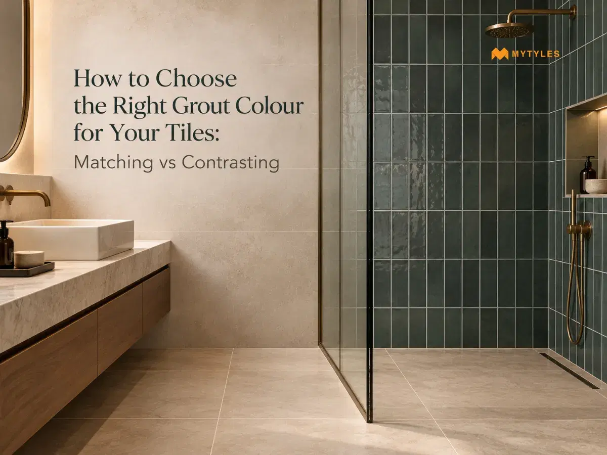
Usually, choosing the tile design is considered a challenging task, but selecting the right grout colour is even more daunting. Yes, with so many tile designs available, you choose the one that appeals to you and fits your space's layout. But grout colour choice aims for a slightly different approach; it is based on many factors, such as the tile's background colour, pattern, joint width and surrounding finishes.
For example, white subway tiles with white grout will result in a more uniform look, while the same tiles with dark grey grout will make the individual tile shapes and layout more obvious. Understanding how matching and contrasting grout colours affect the finished surface can help you make that choice. By the end, you should have a clearer idea of how to choose grout colour for different tiles, as well as the mistakes to avoid.
Matching vs Contrasting Grout: What Changes?
Grout colour can make or break the look of your tile. Likewise, the same grout colour with mosaic tiling can make the design details less conspicuous. But if the grout colour for mosaic tiles is contrasting, it will add more detail. Let’s discuss how these approaches differ and what
happens when you change the grout colour.
When Matching Grout Hides the Tile Shape
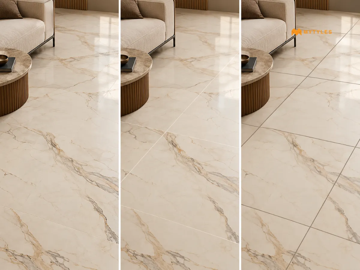
Matching grout colour favours the tile surface. The joint recedes, the colour dominates, and the individual tile shape becomes less important
than the surface's overall effect. This is particularly relevant for tiles where the design, the texture, or the veining is the main character of the tile.
You can consider matching grout with marble-look tile because it may help the veining pattern read continuously across the surface without the grid interrupting it. The same tile with a white grout on a cream base reads almost the same. But introduce even a slightly darker grout, and the joints start cutting across the veining at regular intervals, which breaks the continuity.
When Choosing Contrasting Grout With the Tile Pattern
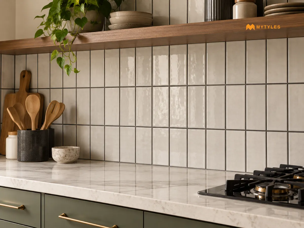
Contrasting grout colour is used to make the grout stand out from the tile layout. If tiles already have a good pattern, the contrasting grout can either match or provide an additional visual detail, depending on the tile's colour, pattern and joint width.
A contrasting grout can be used for patterned tile to outline each tile shape and create a more formal look. If the design of the tile is already detailed, though, a strong contrast might make the surface appear busier. In the case of grey grout and white subway tiles, the rectangular form and brick-like pattern are emphasised, whereas light-coloured grout and dark-coloured tiles would have the same effect by accentuating the joints. The important thing to remember is whether you would like the grout lines to be incorporated into the design or whether you want the pattern of the tile to be prominent.
Why Tile Size and Joint Width Matter
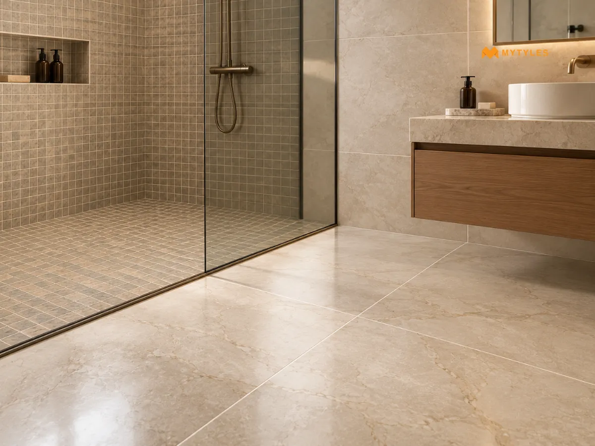
The amount of grout visible can affect how the grout colour looks on a tiled surface. Smaller tiles, such as mosaics, tend to have more grout joints than larger tiles, so the colour of the grout is more visible. For instance, a different colour of grout may be unnoticed when using large format tiles but more noticeable when using small format tiles.
The width of the joints is also important for the overall look. Narrow grout joints are less visible than wider ones, and contrast between the tile and grout colour makes the grout more visible, especially in wider joints. The effect is influenced by the size of the tile, the pattern, the width of the joints and the colours used. When deciding on a grout colour, keep in mind the amount of grout that will show through the finished product.
How to Choose Grout Colour for Tile Colours and Patterns
There is no single grout colour that works across every tile. The right choice depends on what the tile is doing, what colour it carries, and how much visual information is already on the surface. Here is a quick grout colour guide to help you choose the grout colour based on the tile colours and patterns.
Matching the Tile's Main Colour
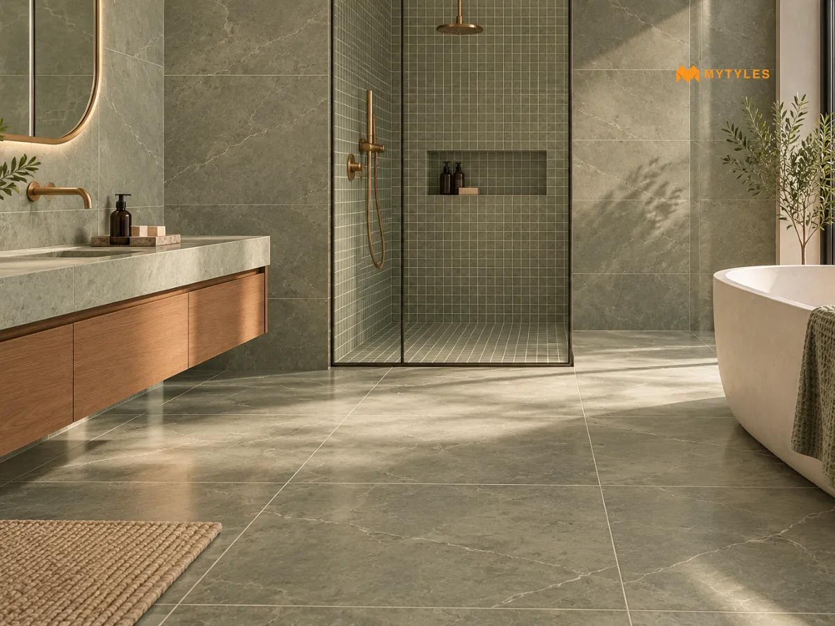
The most straightforward approach is to find a grout shade that sits as close as possible to the dominant colour of the tile. This works across most neutral tiles, stone-look and marble-look surfaces, and large-format tiles where the intention is a continuous surface. Grout can appear different while wet and after curing. The final appearance can also be affected by the grout formulation, mixing, application and curing conditions.
Picking Up a Secondary Colour
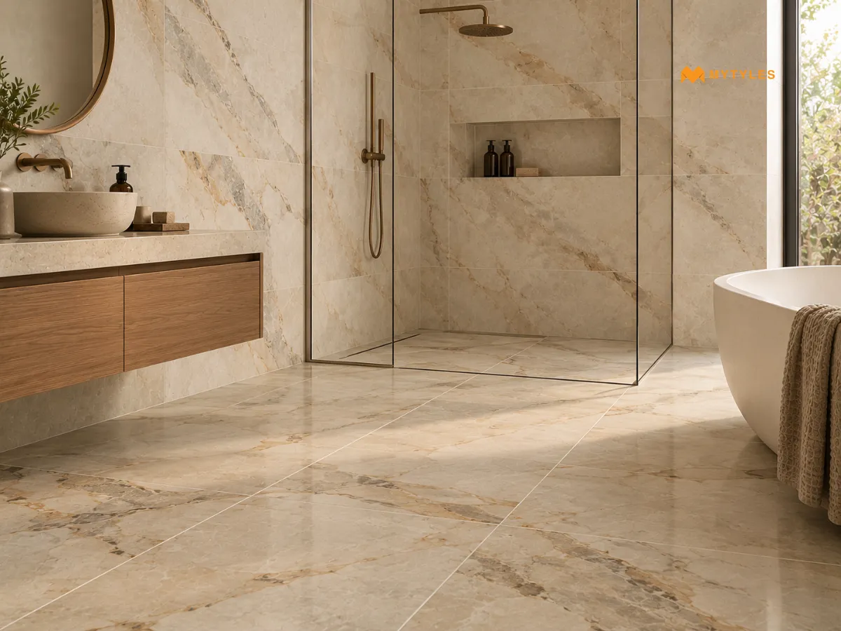
Some tiles feature a combination of colours or subtle shade variations. For example, a beige tile with grey veining, a white tile with a cream background or a terracotta tile with darker clay tones running through it. A secondary colour within the tile, instead of matching the dominant colour or contrasting against it, makes for a grout choice that is tied to the tile but doesn’t fade into it. This way of doing things tends to make the installation feel more thought-out and more considered than either a straight match or a strong contrast.
Choosing a Neutral Shade
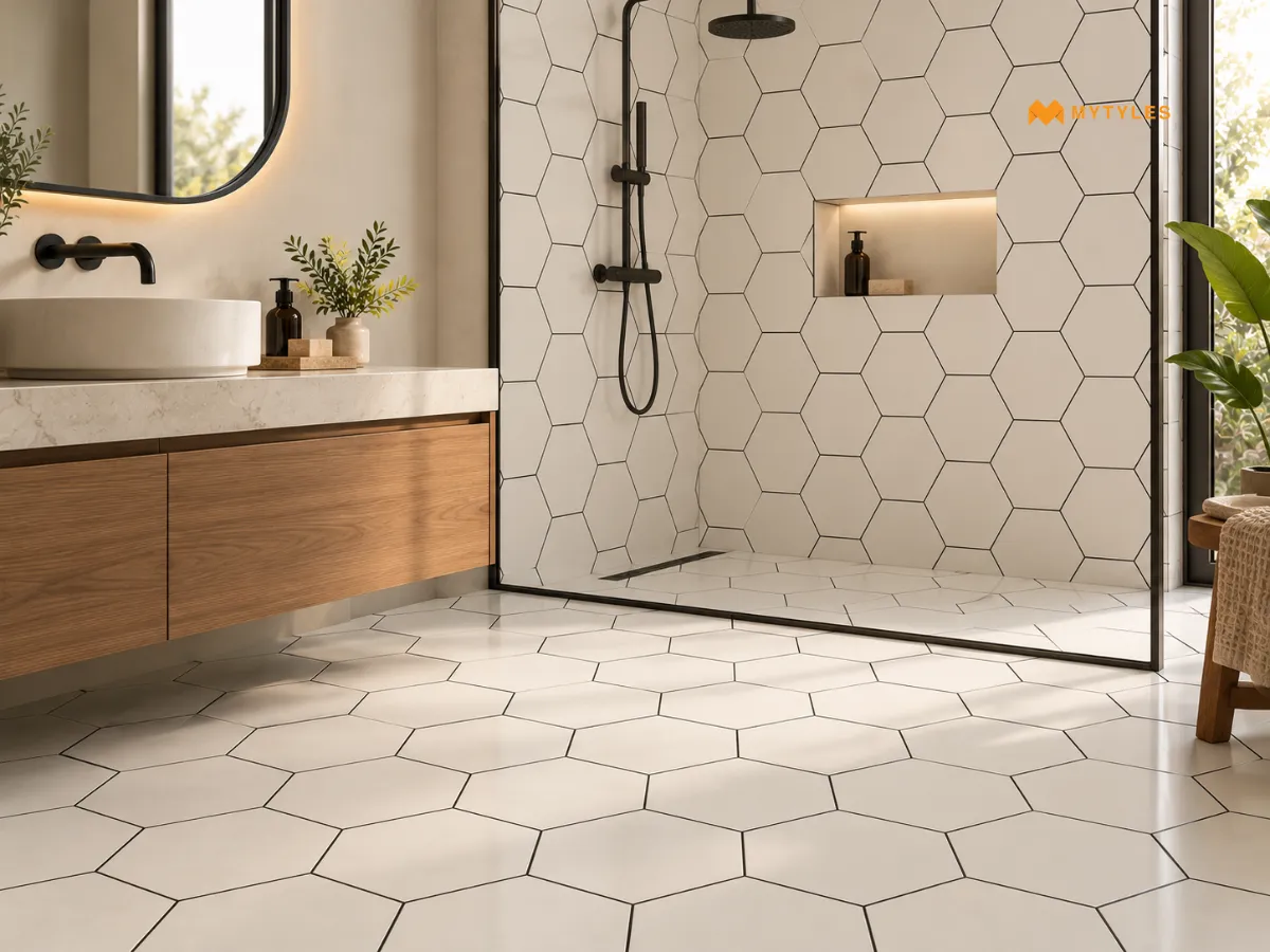
When choosing grout colour for tiles, first consider the colour of the tile. If it is strong, bold, or unusual, a neutral grout colour may be considered a suitable option. Going darker with the grout will add more contrast. Let’s take an example: a black grout with white tiles creates clearly defined joints and draws attention to the tile layout. This combination can work particularly well with geometric tiles like hexagonal tiles, where the laying pattern becomes a visible part of the design.
Common Grout Colour Mistakes to Avoid
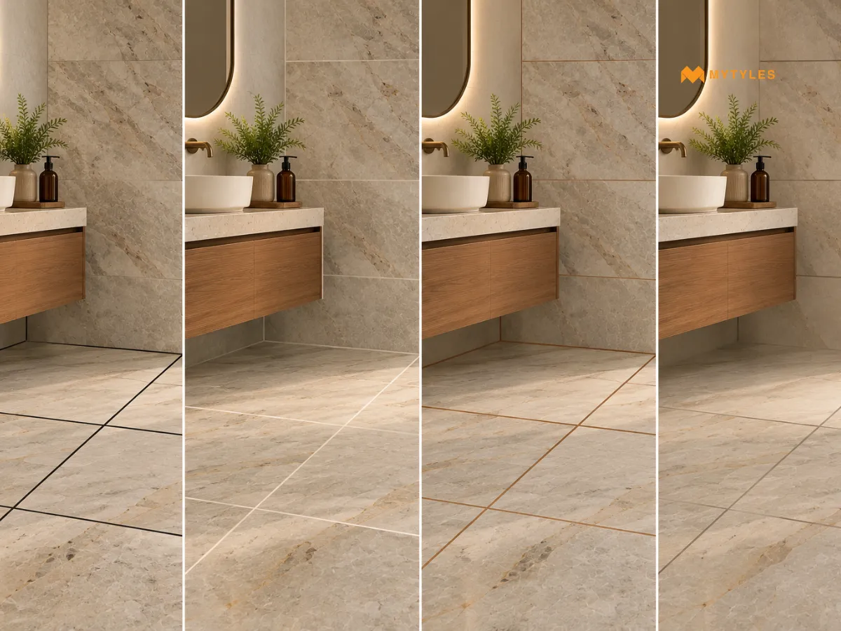
The choice of grout colour influences joint visibility, pattern definition and the overall appearance of a tiled surface. Lighting, tile finish, joint width, and grout colour can also affect the final result. Reviewing these factors before installation will help to avoid unintended colour contrasts and layout inconsistencies. The table below outlines common mistakes regarding choosing grout and how to fix them.
Common Grout Colour Mistakes | What to Check |
Grout Selection and Installation | Compare grout swatches with the actual tile before deciding. |
Grout Colour and Joint Visibility | Check tile and grout combinations under the room's natural and artificial lighting. |
Grout Selection and Prevention | White grout may require more frequent cleaning than mid-tone or darker shades. |
Grout Contrast and Appearance | Grout can occupy a noticeable portion of mosaic surfaces, depending on tile size and joint width. |
Grout Colour and Joint Design | Contrasting grout highlights joints and may complement or compete with the tile pattern. Compare samples before choosing. |
How to Choose Grout Colour for a Balanced Tile Design
There is no single best grout colour for tiles. The right choice depends on the tile, the joint width, the room’s lighting, and what the finished surface is meant to do visually. A large-format marble-look tile in a formal bathroom calls for a different grout approach than a small geometric Moroccan tile in a compact bathroom.
The most reliable approach is to treat grout as part of the tile decision, not a step after it. Bring the tile home before ordering. Check potential grout colours against it in the actual room and under the room’s actual lighting. Make the grout decision with the tile in hand, not just from a colour chart. Explore the tile collection at MyTyles to find designs that suit your space, and consider how the grout colour will complement your final selection.

Is There a General Rule for Choosing Grout Colour for Different Tile Designs?

A useful rule is to match grout with the tile's main background colour for a blended appearance or choose a contrasting shade to highlight the joints. Dark brown can complement walnut-look tiles, beige can suit travertine-look tiles, and black or dark grey can work with black marble-look tiles featuring bronze veins. Always compare physical samples before finalising.
What Grout Colour Goes With Beige Tiles?
Beige tiles can be paired with warm cream, ivory or similar beige grout for a blended appearance. Light grey creates a subtle contrast, while darker brown makes the joints more noticeable. Consider whether the tiles have warm or cool undertones. A grout shade that complements the tile's background colour can help maintain a consistent overall appearance.
What Is the Best Grout Colour for Wood-Look Tiles?
For wood-look tiles, grout close to the tile's main background colour can make the joints less noticeable. Light brown or beige may complement oak-look tiles, while deeper brown can suit walnut-look designs. Contrasting grout highlights individual planks and their laying pattern. Consider the variation in wood grain when choosing a suitable grout shade.
How Do You Choose Grout Colour for Bathroom Floor Tiles?
When choosing grout colour for bathroom floor tiles, consider the tile shade, joint width and cleaning requirements. Light grout may show certain stains more readily, while darker grout can make pale hard-water deposits or soap residue noticeable. Choose a grout product suitable for the bathroom floor conditions, as colour alone does not determine its performance.
What Is Grout Colour Sample Testing?
Grout colour sample testing involves comparing different grout shades with the selected tiles before installation. It helps assess how the grout appears against the tile's colour, pattern and intended joint width. Physical samples or a small test installation can be used to compare shades under the room's lighting and evaluate the grout's appearance after curing.
Which Grout Colour Should You Choose for Black and White Tiles?
For black and white tiles, grout colour depends on the intended visual effect. White grout blends with white sections, while black grout blends with darker areas. A dark grout with white tiles gives a very strong contrast. Grey provides a middle ground that can outline both colours without creating the strongest contrast. The tile pattern and grout contrast influence how prominent the finished layout appears.
What Mistakes Should You Avoid When Choosing Bathroom Grout Colour?
Grout colour for bathroom tiles must not be selected by just looking at the tile in the showroom alone, ignoring tile undertones and assuming dark grout never shows dirt. Another mistake is choosing a colour without considering the bathroom's lighting and joint width. Compare physical samples with the actual tiles before installation, as the final cured grout colour may differ from the sample chart.

ABOUT THE AUTHOR
Nabiya Naqvi
Nabiya Naqvi is a content writer with a postgraduate background in chemical sciences and a strong passion for creative expression. Her journey into writing began with a love for storytelling and gradually grew into a professional path focused on interiors, home decor, and design-led content. With a keen interest in beautiful living spaces, Nabiya enjoys simplifying design ideas and making them relatable for everyday readers. Through her writing, she blends creativity, research, and an eye for detail to help homeowners understand how tiles, textures, and thoughtful material choices can transform a space.
Latest Blogs By MyTyles