Inspiration Gallery
Blog
Tile Calculator
08065423741



.svg)


10 Statuario Marble-Look Tile Ideas for Bright and Elegant Interiors
ByAditi Bardhan

Mon , Aug 31 , 2026

Read Time: 5 Min


 Copied!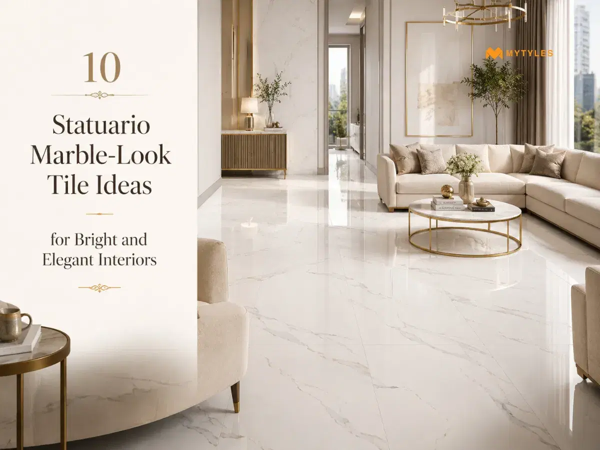
Statuario marble-look tiles usually have a white base with grey veining, which gives them a clean marble-inspired look. They are manufactured tile-format products and are different from natural Statuario marble slabs.
These tiles can be used in selected living rooms, bathrooms, kitchens, dining areas, entrances and feature walls, depending on the tile finish and product suitability. A large floor may need fewer joints. A bathroom wall may need the right surface finish. A TV wall may need proper vein direction and layout planning.
For Statuario tiles for Indian homes, check the room size, natural light, furniture, wall color and daily use before finalising. The tile should support the space instead of making it look too busy or too cold.
10 Statuario Marble-Look Tile Ideas for Elegant Interiors
Before choosing the design, look at where the tile will go. Floor tiles need a different finish from wall tiles. A kitchen backsplash needs easier cleaning. A bathroom shower wall needs proper fixing and waterproofing. These Statuario tile design ideas can help you plan each space better.
Large-Format Statuario Tiles for a Seamless Living Room Floor
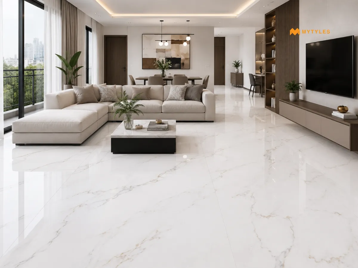
Large-format Statuario tiles work well in living rooms because they reduce visible joints. This makes the floor look cleaner and more open. They suit flats, villas and open living-dining spaces where the floor is seen from many angles.
Use simple furniture if the tile has strong veins. Too many patterns in the sofa, rug and curtains can make the room look crowded. This idea is also useful for bright living-room tile ideas because the white base reflects more light.
Bookmatched Statuario Tiles for a Statement TV-Unit Wall
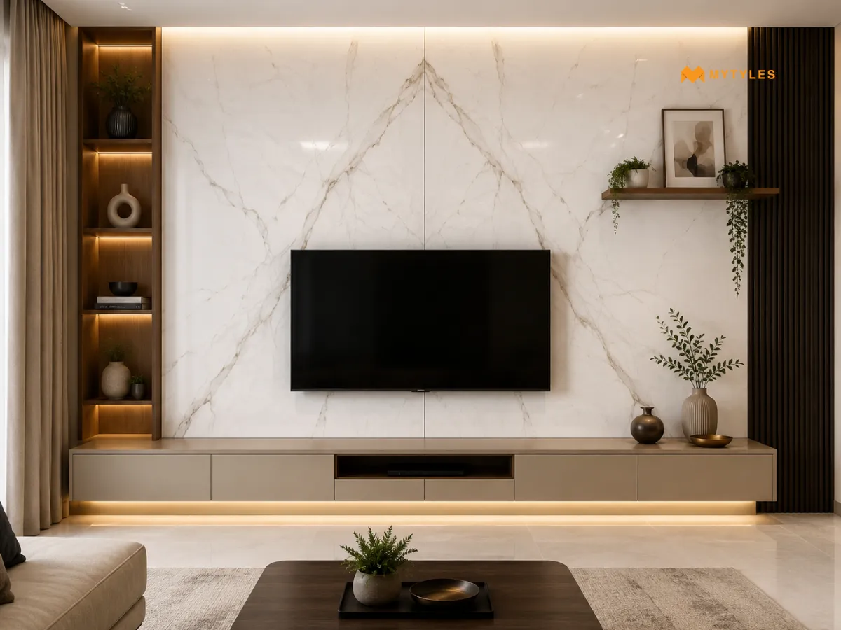
Bookmatched Statuario-look tiles can work well for a TV-unit wall when the product is designed or supplied for a coordinated pattern. In this layout, the veining is planned so the two sides appear to open like a mirror.
Do not assume every veined tile can be bookmatched. Check the product details, slab sequence or tile layout before finalising. A clean Statuario TV-unit wall design works best when the cabinet, shelves and lighting stay simple, so the vein flow remains the main detail.
Polished Statuario Tiles for a Bright Entrance
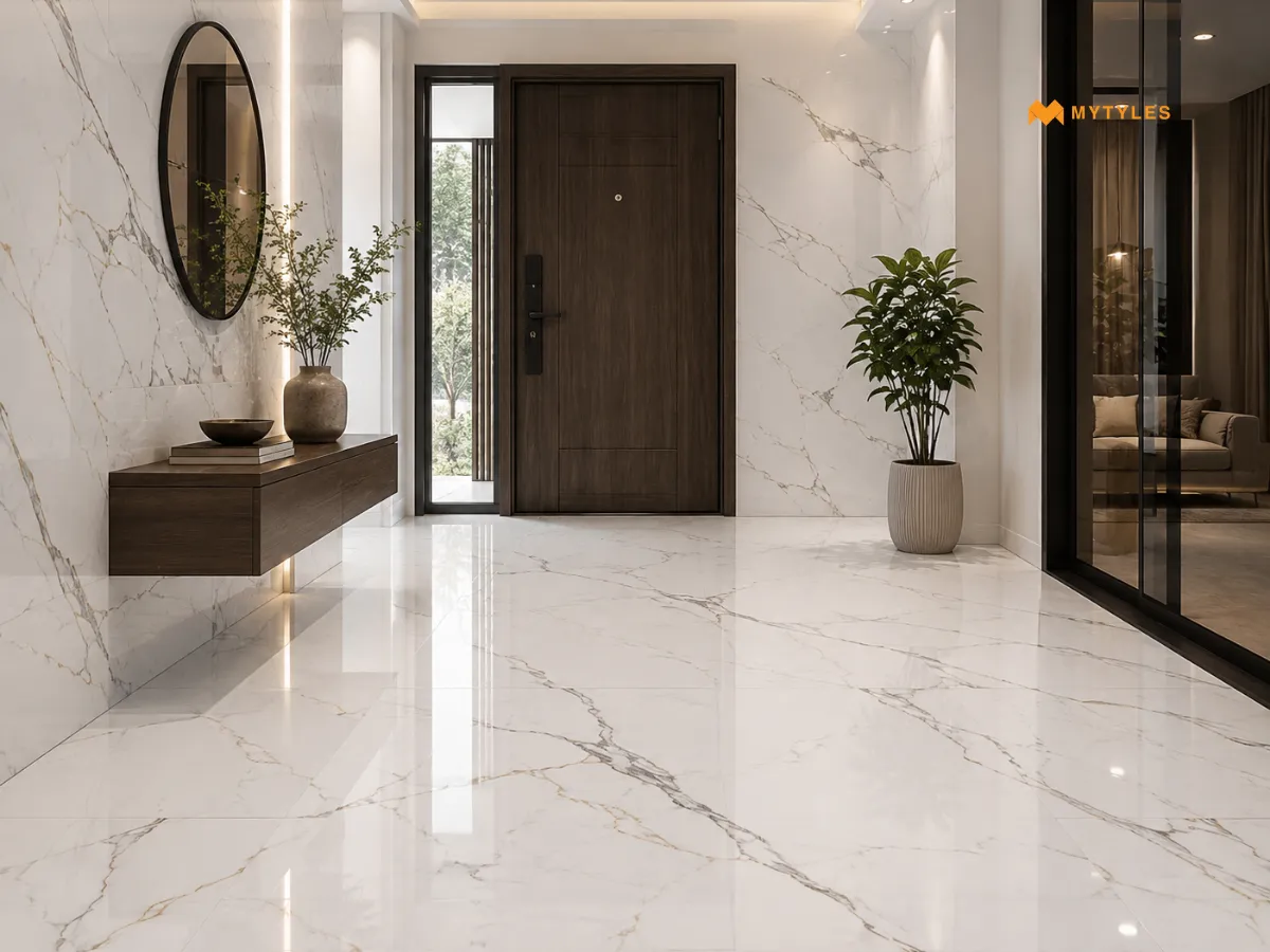
Polished Statuario-look tiles should be chosen for an entrance only after checking floor suitability. Foyers can get dust, wet footwear and regular movement, so the finish matters as much as the design.
If the entrance is close to an outdoor area, check the tile finish carefully before using polished tiles on the floor. For walls, polished surfaces can add a clean shine without needing extra decoration.
Matt Statuario Tiles for a Calm Bathroom Interior
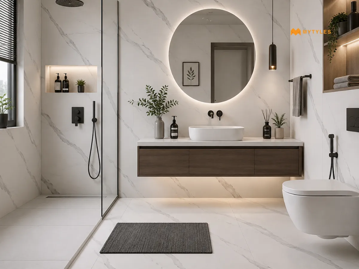
Matt Statuario-look tiles can work well on bathroom walls, vanity backdrops and dry areas when you want a softer surface with less reflection. They give the bathroom a calmer look than polished tiles. For bathroom floors, check slip resistance and product suitability before finalising.
Slip risk also depends on water, soap residue, footwear, floor slope, drainage, cleaning routine and installation quality. For Statuario tiles for the bathroom, choose the finish based on where the tile will be used, not only by how it looks.
Statuario Tiles Behind the Bathroom Vanity
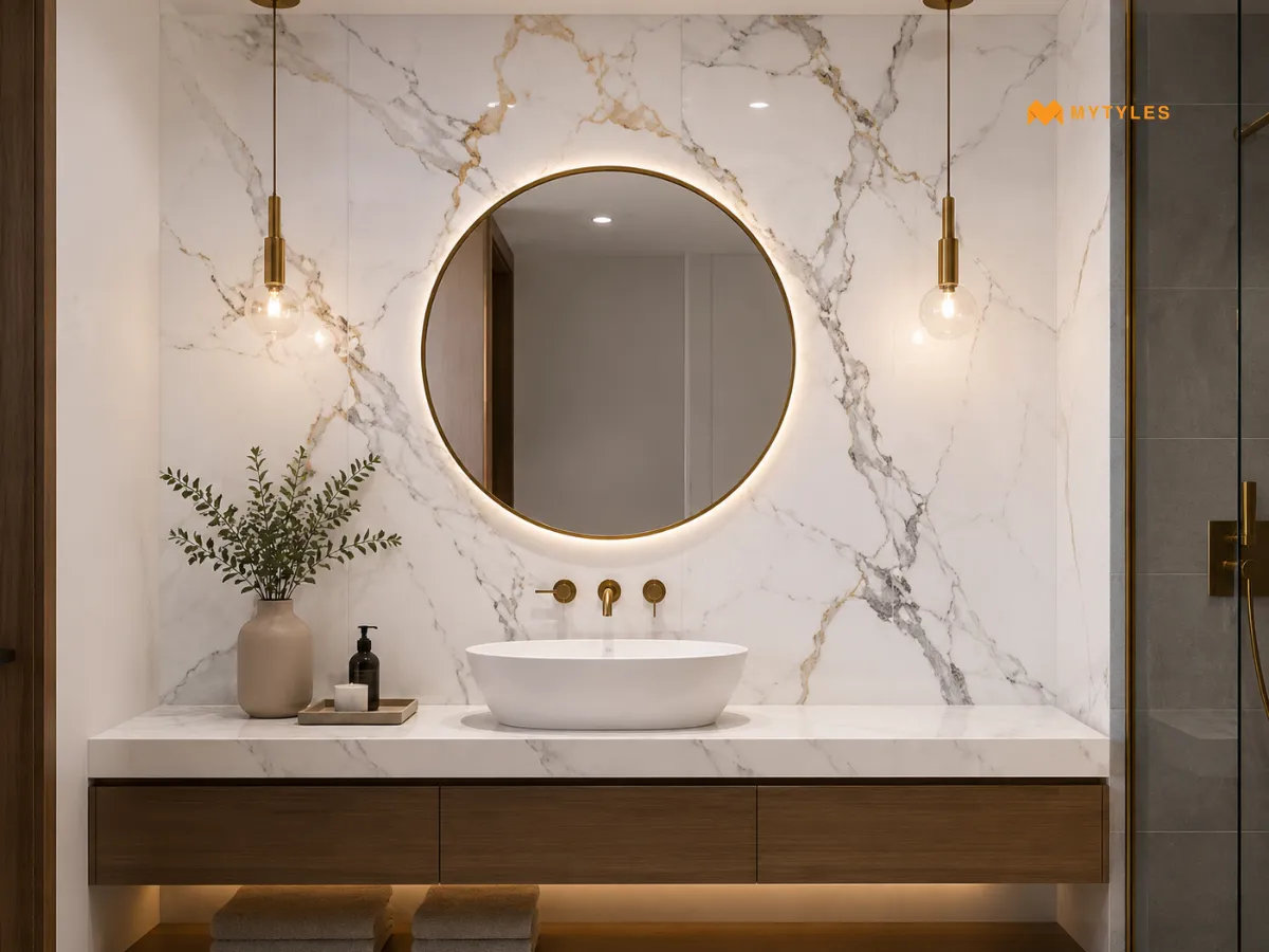
A vanity wall should look clean because it is seen every day. Statuario bathroom wall tiles work well behind mirrors, counters and wall-mounted basins. The white base keeps the area light, while the grey veins add detail.
Use brass, black or chrome fittings depending on the look you want. Keep the basin counter simple. If the counter and wall both have heavy veining, the vanity can start looking busy.
Statuario Tiles for a Full-Height Shower Wall
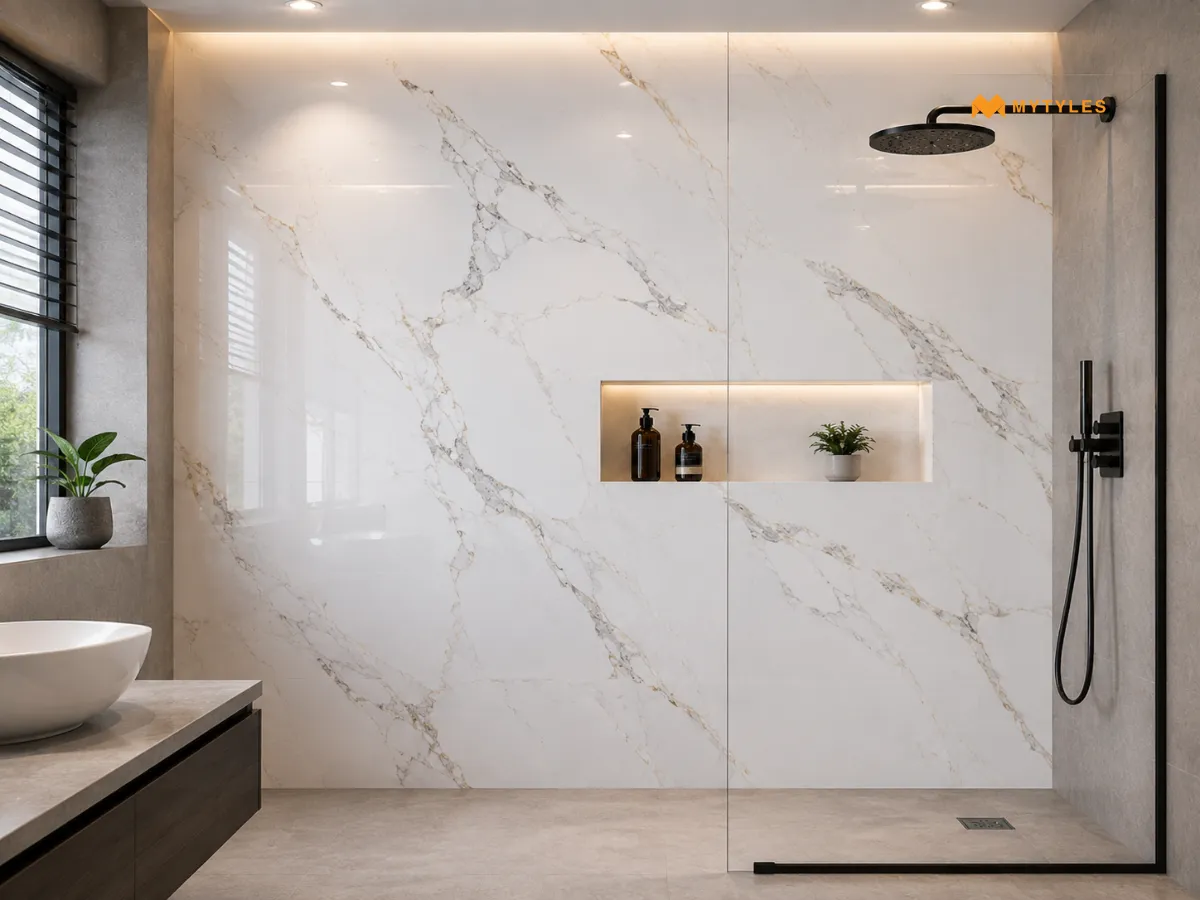
A full-height shower wall can make a small bathroom look more planned. Statuario wall tile ideas work well here when the floor is kept simple. Use tiles from floor to ceiling behind the shower fitting for a clean vertical surface.
In shower areas, waterproofing, adhesive and grout matter as much as the tile design. If the tile has strong veining, match the direction before installation. Random vein breaks can spoil the final look.
Statuario Kitchen Backsplash with Plain Cabinets
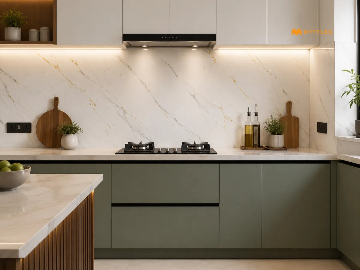
Statuario kitchen backsplash tiles suit kitchens with plain cabinets. They add patterns to the wall without using a printed tile. Use them with white, beige, grey, sage green, walnut or navy cabinets.
Avoid placing them with very busy cabinet shutters because the wall already has movement. This idea works well for Statuario tiles for kitchen spaces where the backsplash needs to look neat and remain easy to wipe.
White and Grey Statuario Tiles for a Dining Area
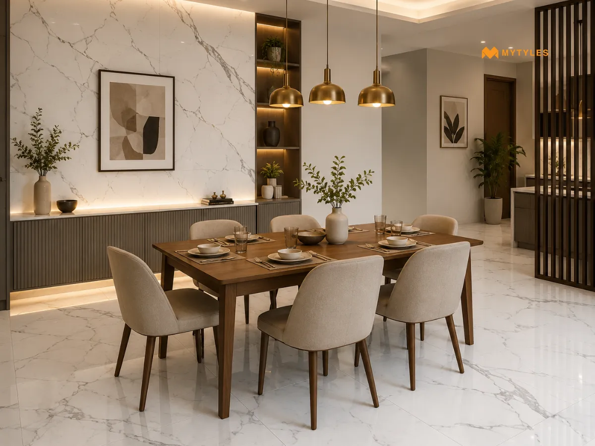
White and grey tile combinations are useful in dining areas because they feel clean and easy to pair with furniture. Statuario tiles can be used on the floor, one wall or a side counter backdrop. Use warm lighting so the white does not feel too sharp at night.
Wooden dining tables, beige chairs and brass lights can soften the look. This idea suits homes that want marble detail without making the dining space too formal.
Statuario Feature Wall with Warm Wood Accents
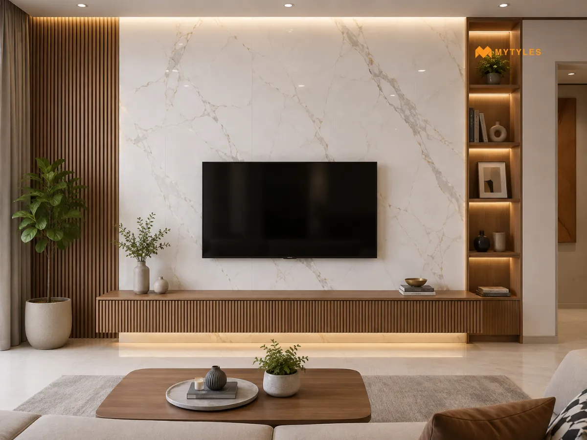
Statuario feature wall tiles look better when paired with warm materials. Wood can balance the cool white and grey surface nicely. Use this idea behind a sofa, TV unit, console or bedroom headboard.
A wooden shelf, fluted panel or simple cabinet can make the wall feel warmer. This is a good way to use marble-look tiles for modern homes without making the room feel cold.
Statuario Tiles with Brass Details for a Premium Look
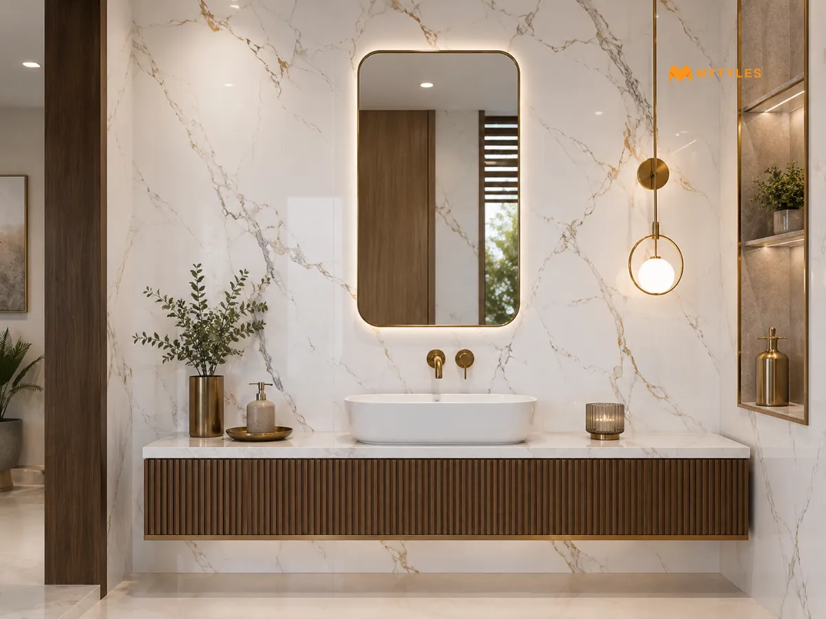
Premium white marble-look tiles pair beautifully with brass details. The brass adds warmth, while the white tile keeps the room bright. Use this combination in pooja corners, powder rooms, foyers, vanity walls and dining backdrops.
Do not overdo the brass. A light, mirror frame, tap or handle is usually enough. This pairing works well for luxury white tile interiors when the rest of the room stays simple.
Tile Material Options to Check
Different Statuario-look tiles can suit different areas of the home. Statuario-look vitrified tiles are often chosen for floors because they can give a clean marble effect in a strong tile format.
- Statuario-look porcelain tiles can work well for both walls and floors, depending on the product details. Always check the application before ordering.
- Statuario-look ceramic wall tiles are better suited for wall areas where floor strength is not needed.
- For high-shine rooms, glazed vitrified Statuario tiles can give a bright surface with a polished look.
- In busier spaces, polished vitrified Statuario-look tiles should be checked carefully for slip suitability before floor use.
- For areas that face more movement, ask if full-body vitrified marble-look tiles are a better fit.
- If you want one design across more than one surface, Statuario-look wall and floor tiles can help keep the room connected.
- For living rooms, marble-effect vitrified floor tiles can give the look of marble while keeping the flooring practical for daily use.
Plan the Right Statuario Look for Each Room
Statuario tiles can make a home look bright, clean and elegant when used in the right way. They work well on living room floors, TV walls, bathroom vanity walls, shower walls, kitchen backsplashes and dining areas. The trick is not to use the same look everywhere. Let one surface become the main focus and keep the rest simple. You can check MyTyles for Statuario-look options in vitrified and ceramic tile choices for Indian interiors. Visit our Experience Centre to see how the white base and grey veins look in person before finalising.

Are Statuario Tiles Good for Living Room Floors?

Yes, Statuario tiles can work well on living room floors when you want a bright marble-like surface with soft grey veins. Use Statuario tiles for living room areas with simple furniture and enough light. For daily use, choose Statuario-look floor tiles in a finish that suits movement, cleaning and family use.
What Is the Difference Between Statuario and Carrara Marble-Look Tiles?
Statuario marble-look tiles usually have a whiter base and more noticeable grey veins. Carrara marble-look tiles often have a softer grey-white base with lighter vein movement. If you want a brighter surface, white marble-look tiles for interiors may suit the room better. Always compare samples under your actual home lighting.
Are Polished Statuario Tiles Slippery?
Polished Statuario-look tiles can feel smoother than matt finishes, especially when the floor is wet. They are usually better for dry living rooms, entrances and wall areas. For bathrooms or wet floors, check slip suitability first. If you want less shine, matt Statuario-look tiles may suit the area better.
Can Statuario Tiles Be Used on Bathroom Walls?
Yes, Statuario tiles for bathroom walls can be used when the product is suitable for wall application. They work well behind vanities, on dry walls and selected shower walls. For wet areas, waterproofing, adhesive and grout work matter. Statuario bathroom wall tiles should also be checked for size and vein direction.
Which Cabinet Colors Look Best with Statuario Tiles?
Plain cabinet colors usually look better because Statuario already has grey vein movement. White, beige, walnut, sage green, navy and soft grey are good options. Use Statuario tiles for kitchen areas with simple shutters. For the wall above the counter, Statuario kitchen backsplash tiles should match the countertop and handle finish.
Are Large-Format Statuario Tiles Suitable for Small Rooms?
Large-format Statuario tiles can work in small rooms if the layout is planned well. Fewer joints can make the surface look cleaner, but cuts around doors, corners and fixtures need care. Before ordering large-format vitrified marble-look tiles, check the room size, wastage and installation comfort with your tile layer.
How Do You Clean and Maintain Statuario Marble-Look Tiles?
Clean Statuario-look wall and floor tiles with a soft cloth or mop and a mild tile cleaner. Avoid harsh acids unless the product care guide allows them. Wipe spills early, especially on polished finishes. Glazed vitrified Statuario tiles should be cleaned as per the product instructions to protect the surface.

ABOUT THE AUTHOR
Aditi Bardhan
Aditi Bardhan is a professional content writer with over five years of experience creating SEO-focused, research-backed content across diverse industries. She specialises in the tile and surface materials space, writing for homeowners, architects, interior designers, and trade professionals. Her work combines technical research, design awareness, and a strong understanding of customer needs, helping readers make clearer and more confident choices. Through her content, Aditi simplifies complex material concepts, highlights practical design benefits, and helps brands build trust and authority in the tile and construction industry.
Latest Blogs By MyTyles