Inspiration Gallery
Blog
Tile Calculator
08065423741



.svg)


8 Ways to Make Solid Colour Tiles Look Premium
ByNandana Priya

Sun , Nov 15 , 2026

Read Time: 5 Min


 Copied!
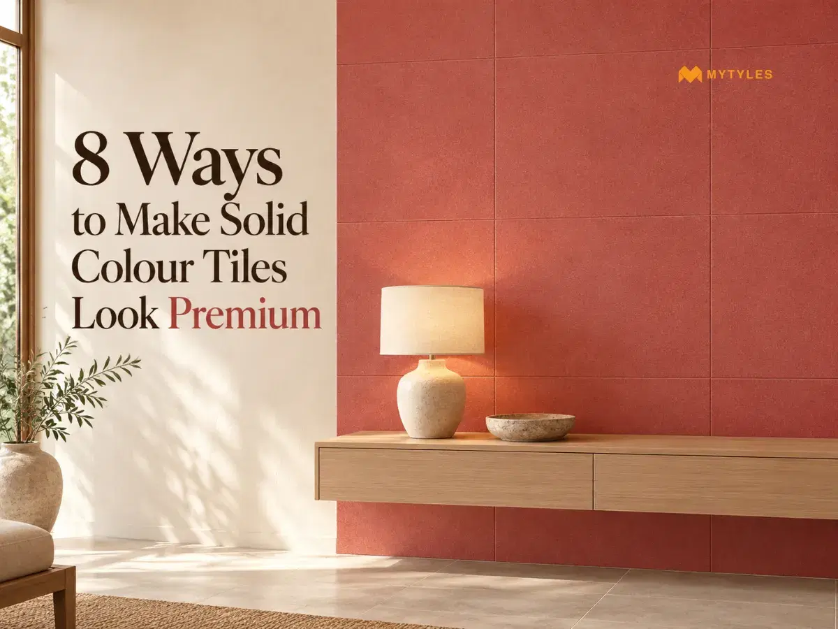
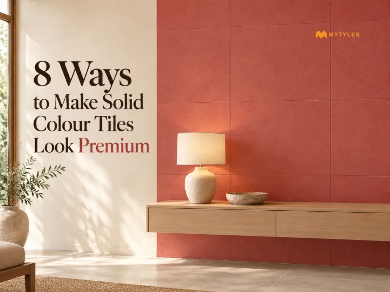
A tile does not need a pattern to feel premium. This is something designers know well. It needs a plan. Think of solid colour tiles as a blank page. How you add colour, finish, layout, and light decides whether a room feels ordinary or elegant.
Plain tiles can look premium without adding busy prints or heavy borders. The answer sits in small, thoughtful choices. A softer grout line, a layered glow, and a clean edge where the wall meets the floor can make this possible. Here are eight ways to achieve a premium look with solid colour tiles.
Give Plain Tiles a Premium Look With Similar Shades
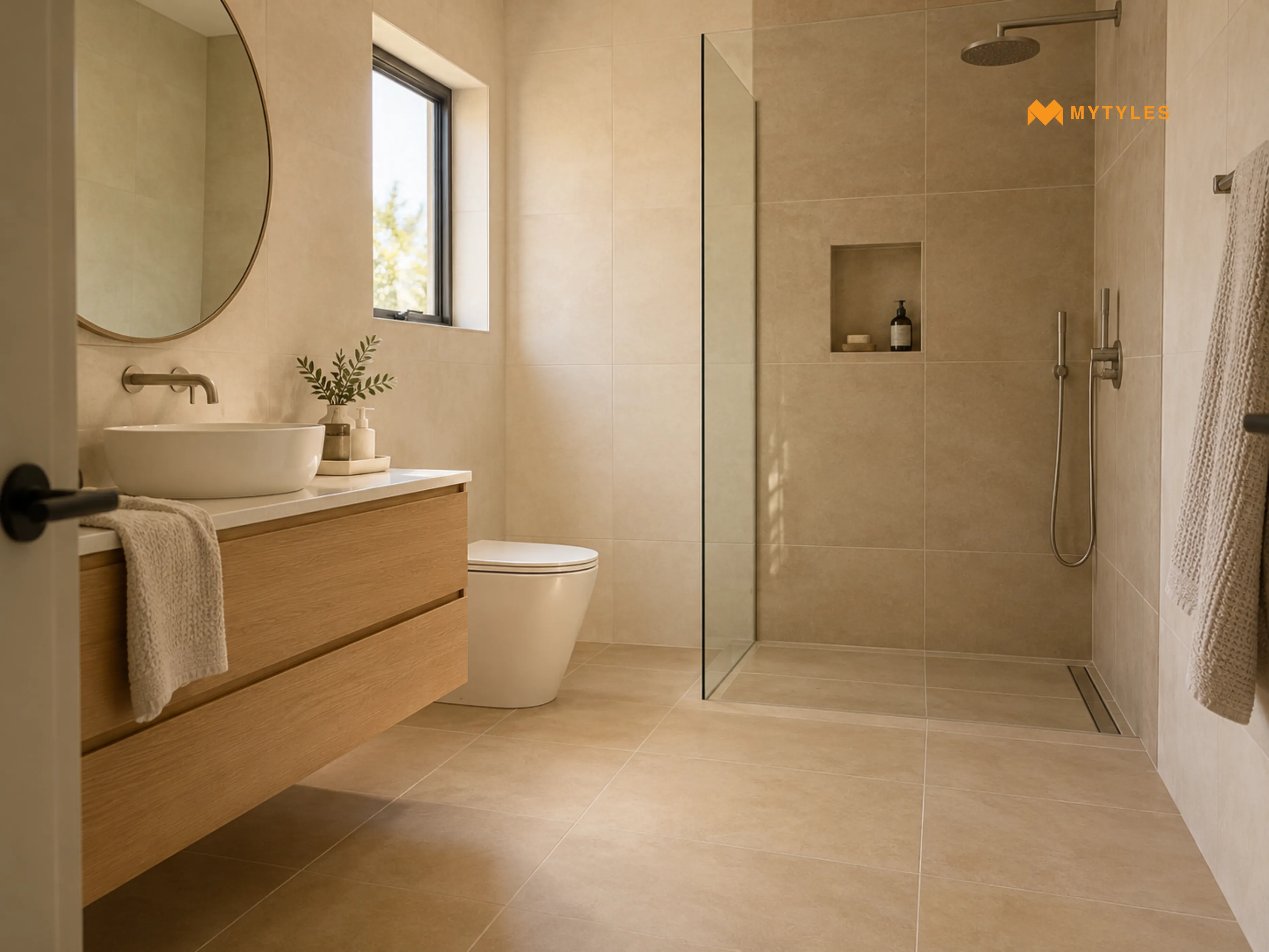
Using just one colour doesn't mean every surface has to be the exact same shade. In fact, a slight change in tone can make a room feel more thoughtfully designed.
Take a bathroom with warm beige floor tiles. Instead of introducing a completely different colour on the walls, choose a lighter cream or sandy beige. The colours sit comfortably together, but there's still enough difference to distinguish the surfaces.
This approach can work well with a monochromatic colour scheme. Here, several shades of one colour are used throughout a space. To create a calm, cohesive appearance, these tone-on-tone tile combinations can be considered.
Make a Bold Statement With a Single Colour Feature Wall
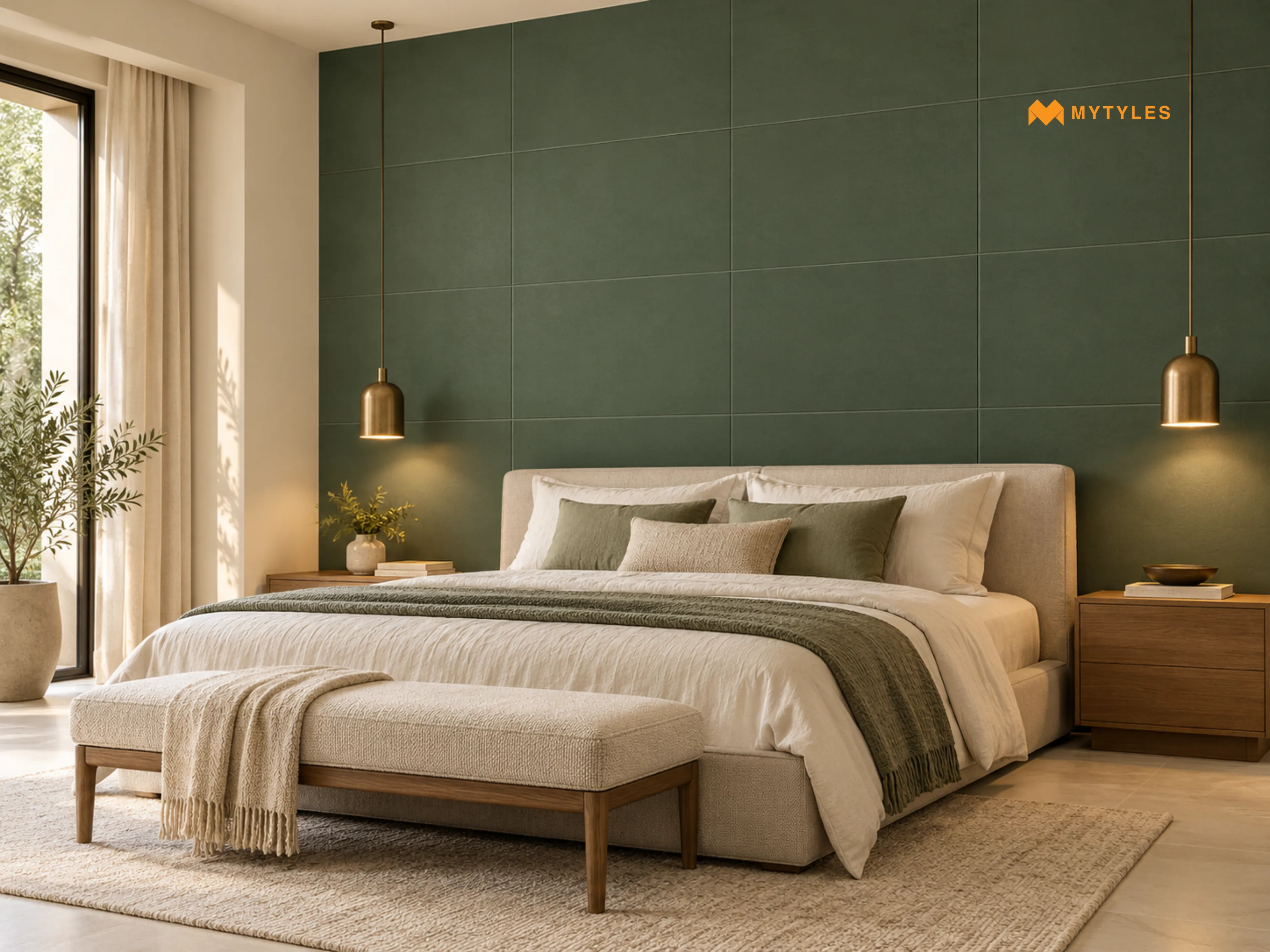
Sometimes, one strong colour makes a greater impression than several competing patterns.
Plain green tiles are a lovely place to start. Deep green feature walls behind a bed or console table tend to feel rich and grounded, particularly when the rest of the room stays soft and neutral. If green feels too cool for your space, try earthy terracotta accents for warmth.
Any suitable plain coloured wall tiles can follow this idea, as long as the shade suits the light in the room. Keep the other walls understated and let the colour take centre stage.
Give Plain Tiles a Designer Look With Creative Layouts
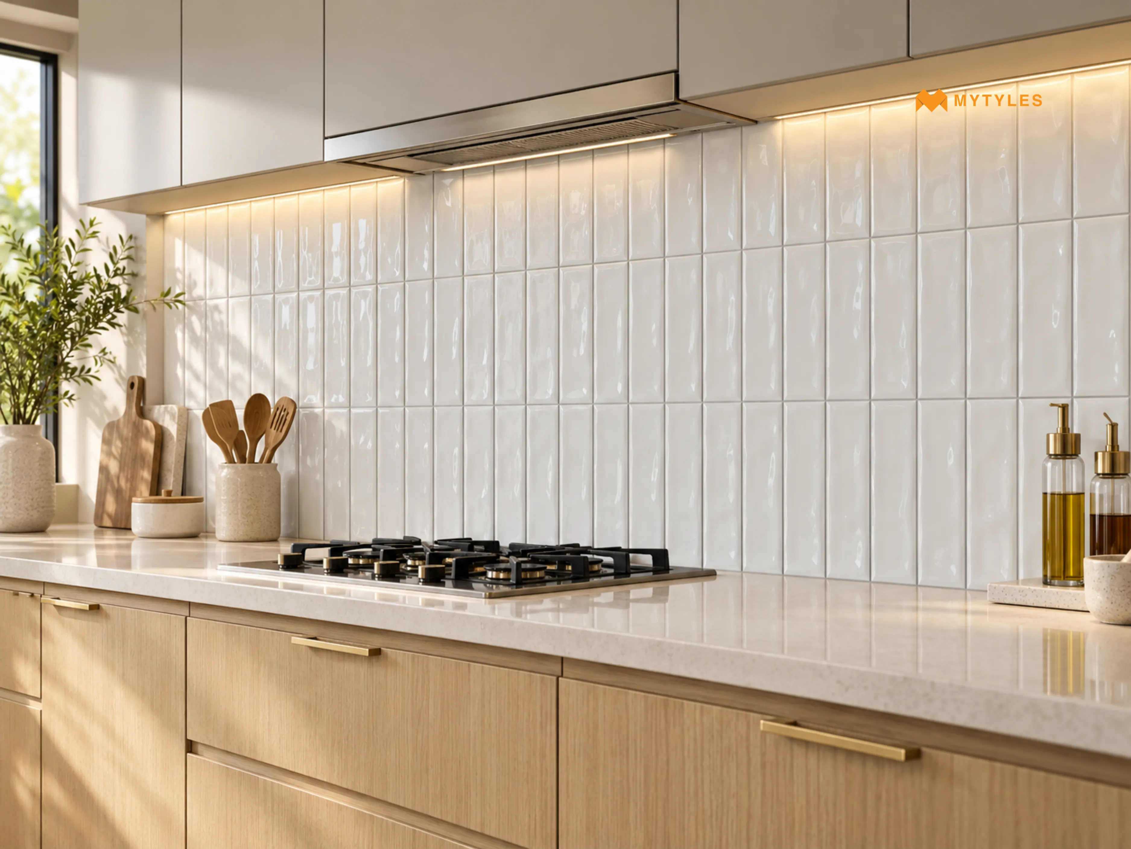
One of the simplest solid colour tile design ideas is to change the direction of installation. Consider a kitchen backsplash made with plain white tiles in a rectangular shape. Laid horizontally, it has a familiar appearance. Turn those same tiles vertically, and the wall takes on a different character.
A stacked tile layout creates straight, aligned joints. A vertical tile arrangement draws attention to the height of the tiled area. In a staggered layout, the joints are offset between rows. This creates a less uniform pattern.
Not all tiles can be used for every laying pattern. Before settling on a layout, check whether the tile's shape and size will work with the pattern you have in mind. Discuss the laying pattern with your installer.
Use Large-Format Tiles for a Sleek, High-End Finish
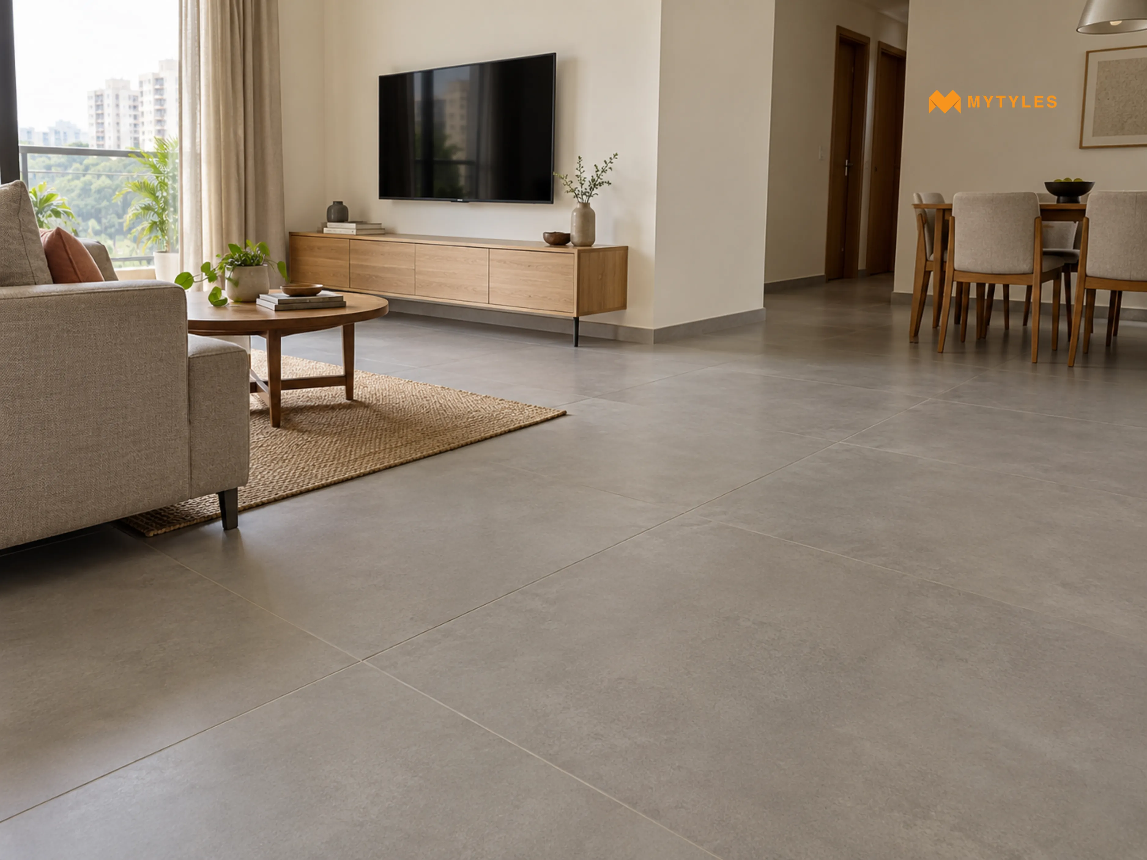
Larger tiles generally have minimal grout joints. They give a continuous-looking appearance when used on the floor or wall. This is because fewer large-format plain tile pieces are needed to cover the same area.
For instance, large-format plain grey tile can give a floor a different appearance from smaller grey tiles laid across the same space. The colour stays simple, while the larger surface becomes the main visual element.
It is important to note that size alone doesn't guarantee a premium result. Large tiles need careful planning, suitable substrate flatness, appropriate adhesive coverage and proper handling. A poorly aligned installation can be especially noticeable when the tile faces are broad and relatively plain.
The Role of Grout Colour in Giving Plain Tiles a Premium Look
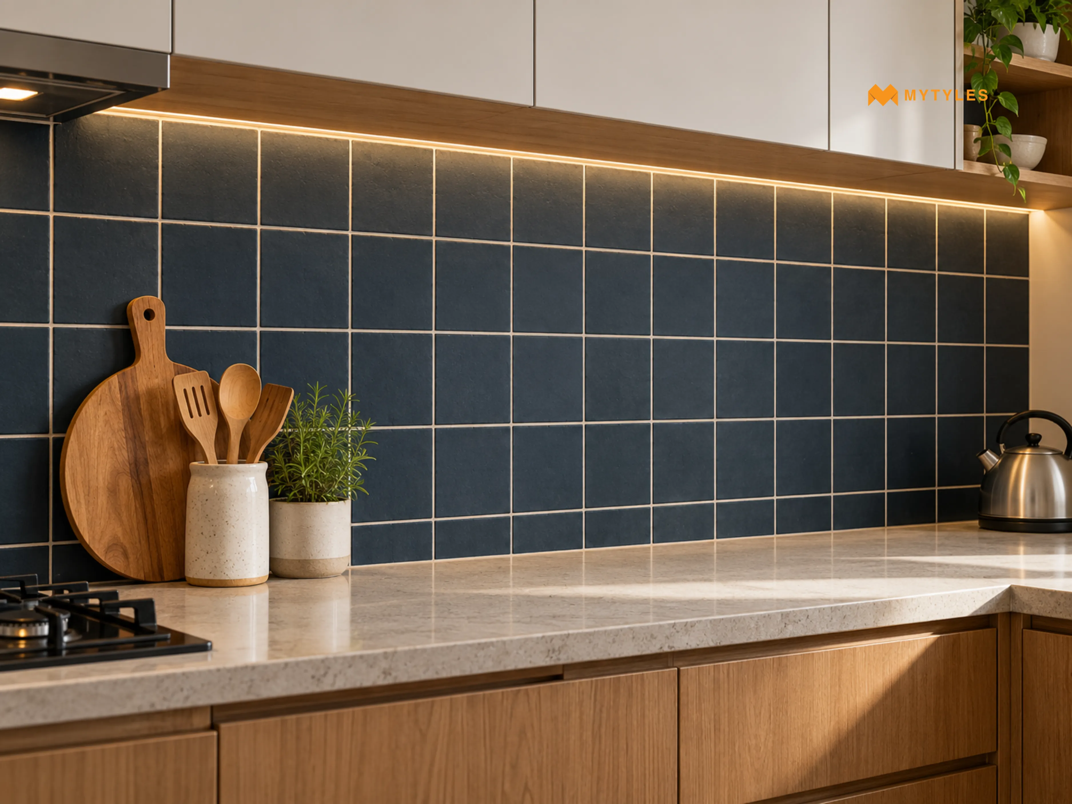
Grout may seem like a small detail, but it can change how an entire tiled wall or floor looks.
Colour-matched grout makes the joints less noticeable. It suits surfaces where the goal is a soft, more unified appearance. For a little definition, go a shade lighter or darker than the tile. This outline gives a plain wall a tailored look without adding a pattern.
Neither choice is automatically better. The grout colour should be considered alongside its practical requirements. Choose a suitable grout for the installation conditions, follow the manufacturer's joint-width guidance, and consider cleaning and maintenance.
How Matt and Glossy Tiles Can Make a Room Look Premium
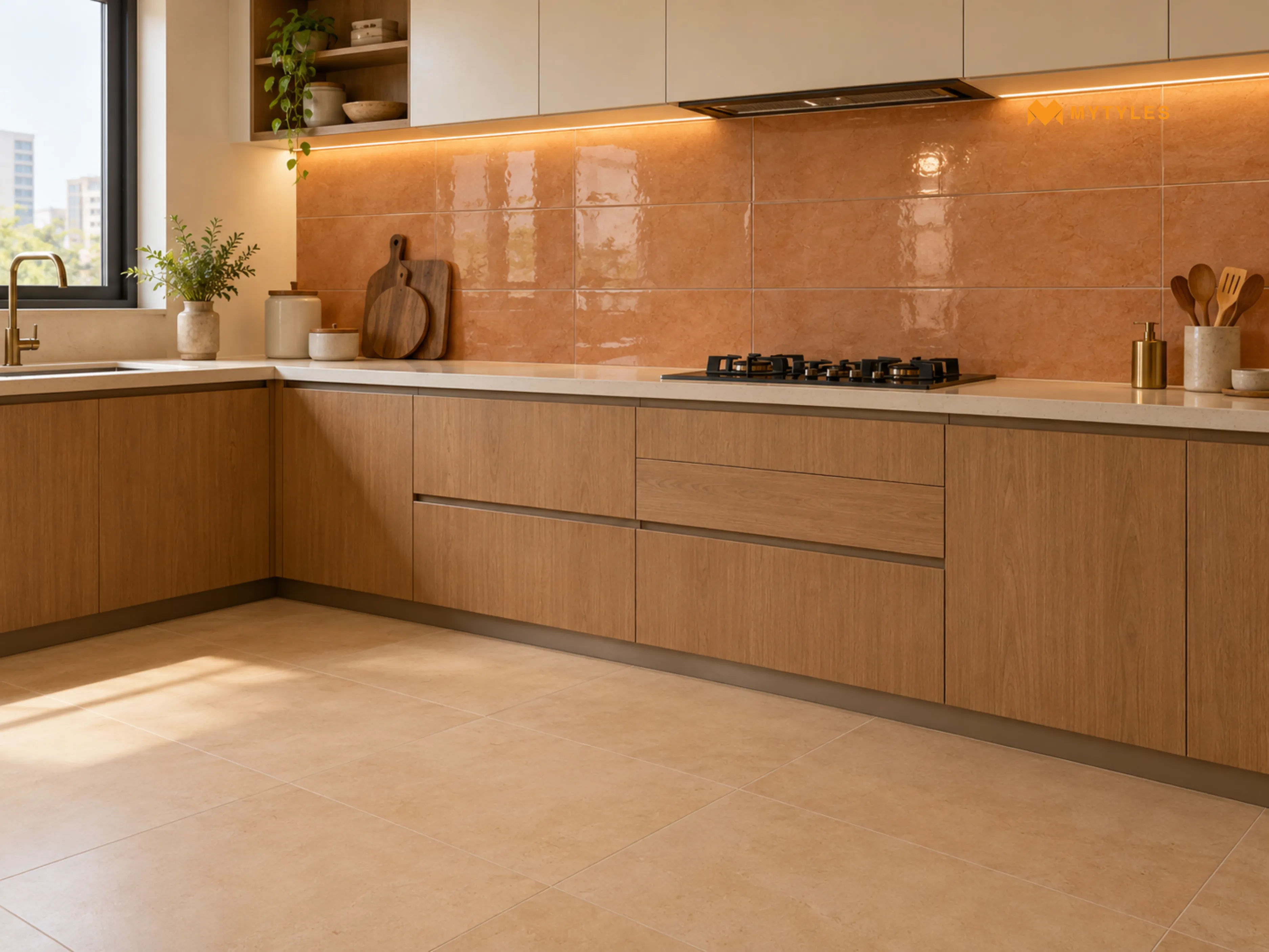
Two tiles in the same colour can look noticeably different when their finishes change.
A matt tile finish has a low-sheen appearance, while a glossy surface reflects more light. That difference can be used deliberately, rather than treating the finish as an afterthought.
Consider plain terracotta tiles on a kitchen wall. A matt surface gives the colour a more subdued appearance. A glossy wall tile in a similar earthy shade reflects nearby lighting and may make the surface appear more prominent. You could also pair a matt neutral floor with glossy wall tiles, provided both products are suitable for their intended applications.
Please note, matt does not automatically mean anti-skid, and glossy does not automatically mean unsuitable for flooring. Floor suitability and slip performance must be checked through the individual product specifications, especially in wet areas.
Elevate Plain Tiles With Thoughtful Lighting
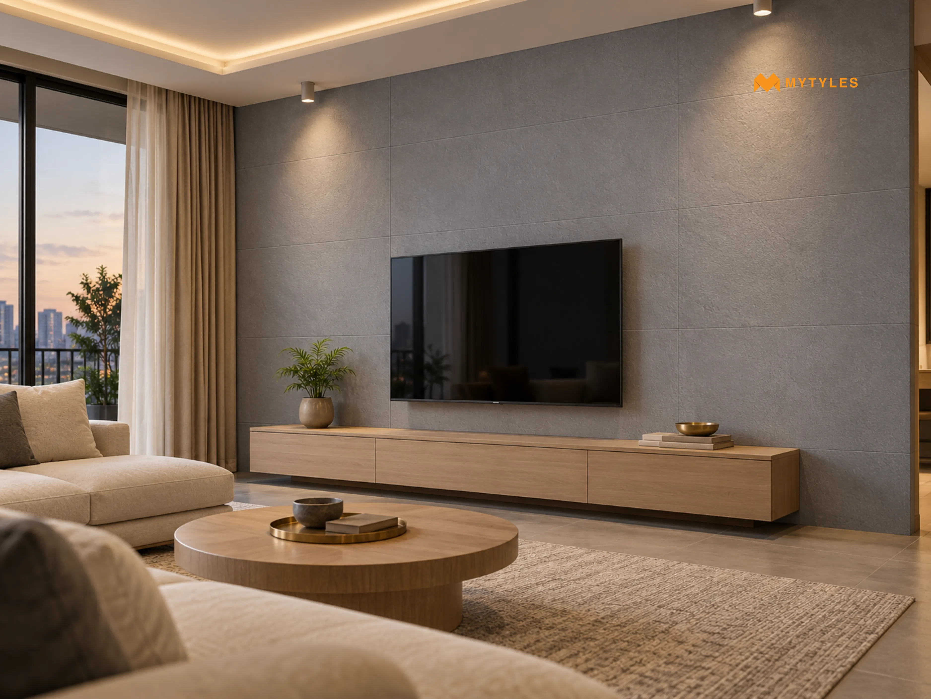
A tile colour rarely looks the same under every type of light. Warm lighting can highlight the earthy shades of beige and terracotta tiles. Cooler lighting may bring out bluish undertones in certain grey tiles.
You can also combine different light sources. This can help bring out the colours and finishes of plain wall tiles. This makes layered interior lighting particularly useful when working with plain coloured wall tiles.
Begin with ambient lighting for general brightness, then add focused lighting where you want to highlight the tiled surface. Avoid placing lights solely to create dramatic reflections. The room might still need comfortable, practical illumination. The goal is to let the plain tile colour look its best without making the lighting itself the main attraction.
Create a Polished Look With Tile Trims and Finishing Details
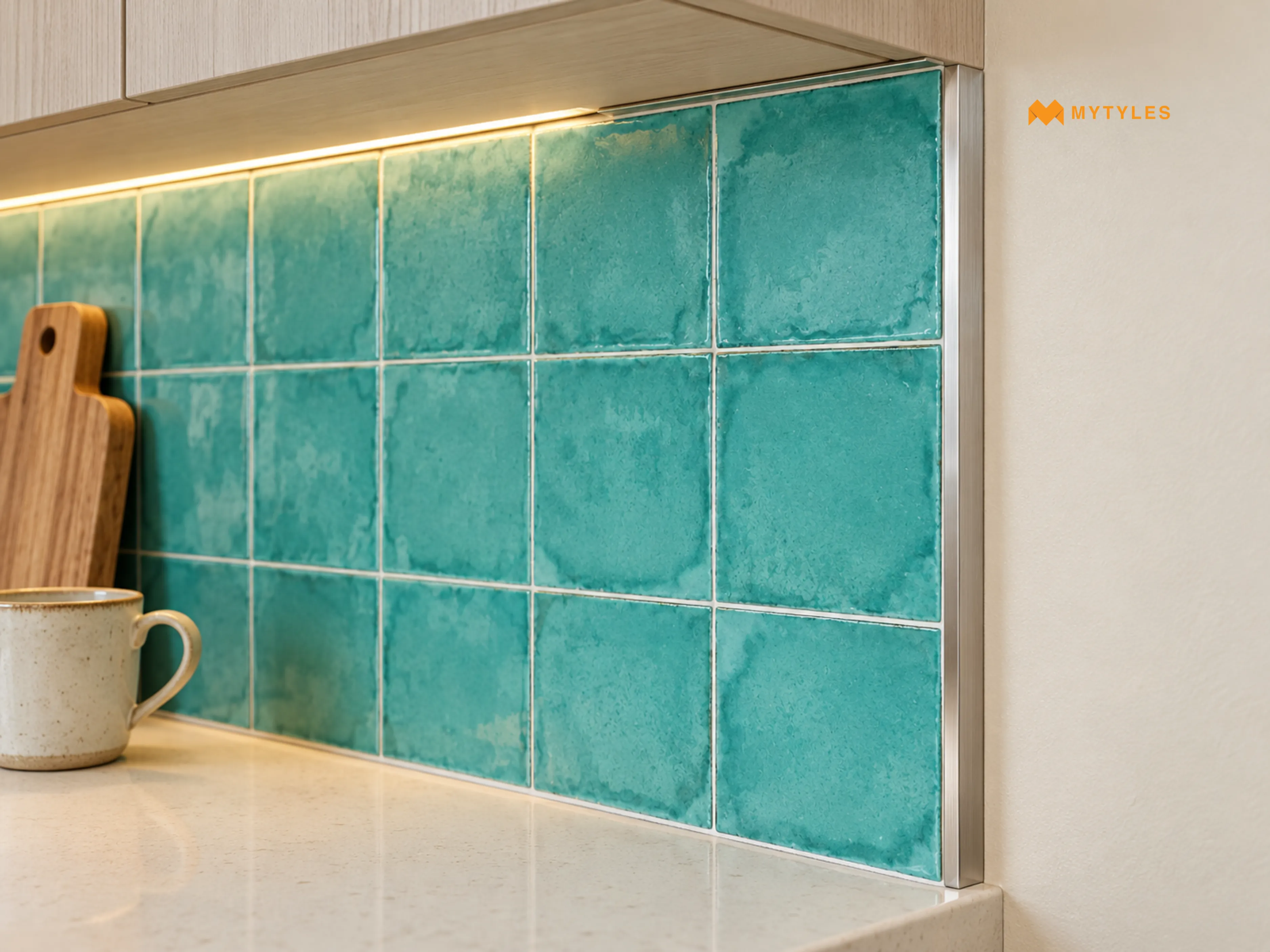
A beautifully chosen solid colour tile can lose some of its appeal when the edges are poorly finished. This becomes particularly noticeable with plain tiles because there isn't a busy pattern to distract the eye.
Think about the exposed edge of a tiled kitchen backsplash. A suitable finishing profile can provide a neat transition where the tiles meet a painted wall. Similarly, tile edge trims and skirting can help define the boundary between different surfaces. The details around corners, doorways, and floor transitions deserve equal attention. Where two materials meet, the finished levels and movement requirements should be considered before installation.
A premium-looking result is rarely about adding more decoration. Often, it's about making sure the details already present have been properly planned.
Make Every Detail Count With Solid Colour Tiles
Making plain tiles look premium isn't necessarily about spending more. A carefully planned colour combination, a different tile direction, or neatly finished edges can change how a room comes together.
Start with the surface you want to highlight, then consider the colours and materials around it. At MyTyles, you can view solid colour tiles in porcelain, ceramic and vitrified tile options in different finishes, including matt and glossy. Take a closer look at the collection on the MyTyles website. You can also visit the Experience Centre to see them in person.

How to Make Plain Tiles Look Premium?

To make plain tiles look premium, focus on how the colour, layout, and surrounding details work together. You can combine similar shades for a coordinated appearance or use contrasting colours to highlight a particular area. Consider the tile finish, grout colour, and lighting as well. Neatly finished edges and a carefully planned layout can make even simple tiles look more refined.
Can Solid Colour Tiles Make a Small Room Look Bigger?
Solid colour tiles in lighter shades, such as white, cream, and beige, can make a small room feel more open, particularly when paired with similarly coloured walls. Using fewer contrasting colours may also create a more continuous appearance. However, the overall effect depends on the room's lighting, furniture arrangement, tile dimensions, and available space.
Which Plain Tile Colours Work Well With Wooden Furniture?
Plain grey tiles, beige, cream, and terracotta are worth considering alongside wooden furniture. Beige and terracotta can complement warm wood tones, while grey can create contrast with brown furniture. For a coordinated appearance, consider the undertones of both the flooring and furniture. You can also balance darker wooden pieces with lighter tile colours.
How Can I Use Plain Black Wall Tiles Without Making a Room Look Too Dark?
Plain black wall tiles can be used on a selected feature wall or a smaller section rather than covering every wall. Pairing them with lighter flooring, neutral furniture, or contrasting fittings can balance the darker colour. Consider the amount of natural and artificial light available. A glossy finish may introduce noticeable reflections, depending on the lighting arrangement.
Can I Combine Matt and Glossy Solid Colour Tiles in the Same Room?
Combining matt and glossy solid colour tiles can introduce variation without relying on decorative patterns. For example, a matt beige floor can be paired with glossy cream wall tiles for a subtle difference in surface appearance. You can also use similar colours in both finishes. Check that each product is suitable for its intended wall or floor application.
Are Solid Colour Tiles Easier to Clean Than Patterned Tiles?
The cleaning requirements of solid colour tiles depend on the material, finish, surface texture, and grout rather than the absence of patterns. Plain white tiles may show certain marks more noticeably, while darker tiles may reveal dust or residues under particular lighting. Follow the manufacturer's recommended cleaning instructions for the selected product.
How Do I Choose Between Ceramic and Vitrified Solid Colour Tiles?
Ceramic solid colour tiles are made from clay-based materials, while vitrified tiles are manufactured with dense, low-water-absorption bodies. Both materials are available in different colours and finishes. Consider whether the tiles are intended for walls or floors, along with their dimensions, surface appearance, and cleaning requirements. Check the individual product specifications before making a selection.

ABOUT THE AUTHOR
Nandana Priya
With a strong interest in design, creativity, and emerging tile trends, I enjoy turning ideas from the world of tiles and interiors into engaging, meaningful reads. My writing focuses on creating well-researched content that helps readers understand design choices with more clarity and confidence. I bring together research, design awareness, and digital marketing insights to craft content that is relevant, easy to follow, and thoughtfully written for todays homeowners and design-conscious readers.
Latest Blogs By MyTyles